

Johnson & Wales
We want to avoid use of the color blue on our site as it is the primary color of J&W.
Scott - J&W does a really good job of reinforcing their brand identity through their photography - their photos almost always include blue/yellow elements and the people are frequently wearing J&W swag.
Dan - I like that they put the US news rankings -- although bogus. We should explore if we'd want to do same

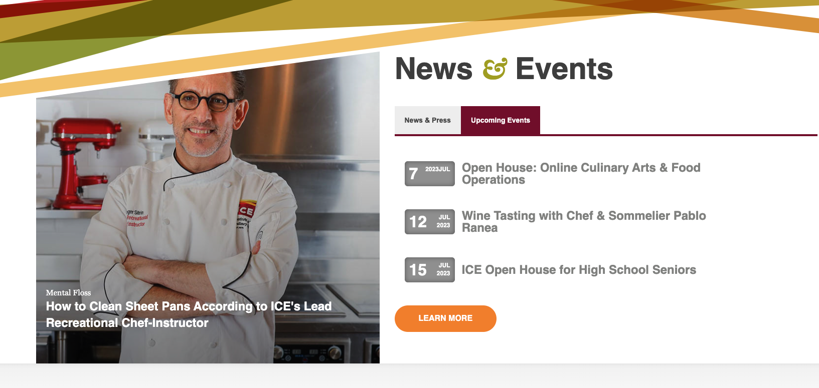
Institute of Culinary Education
Scott - Their homepage is attractive, visually appealing without being distracting. I like their "Culinary Leaders Praise ICE" section.
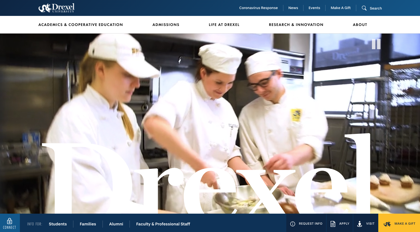
Drexel
Dan - I'm intrigued by the CTA being bottom right. It does feel more natural for eye path to get to CTA bottom right. But not sure about the navigation being at bottom.
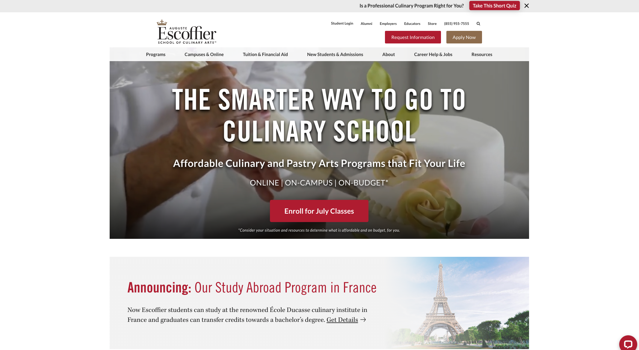
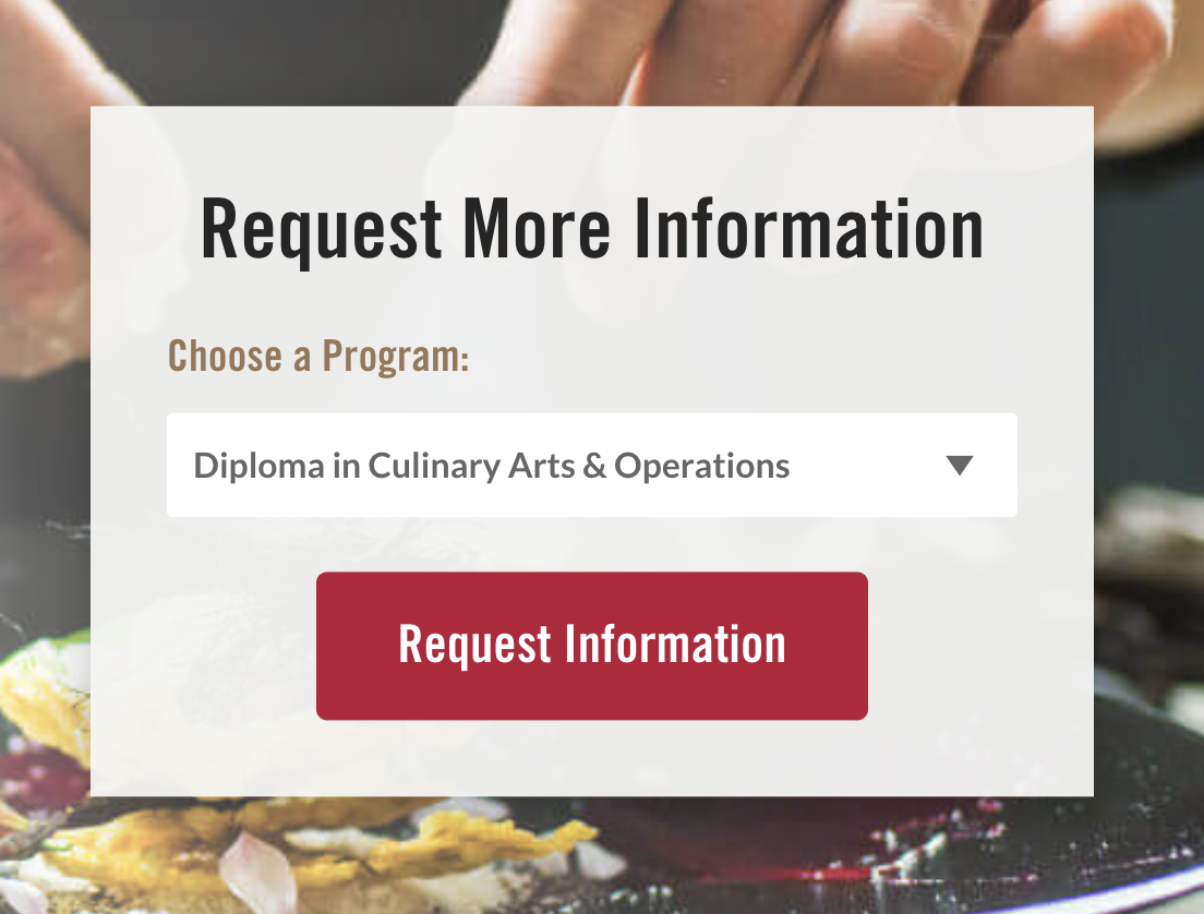
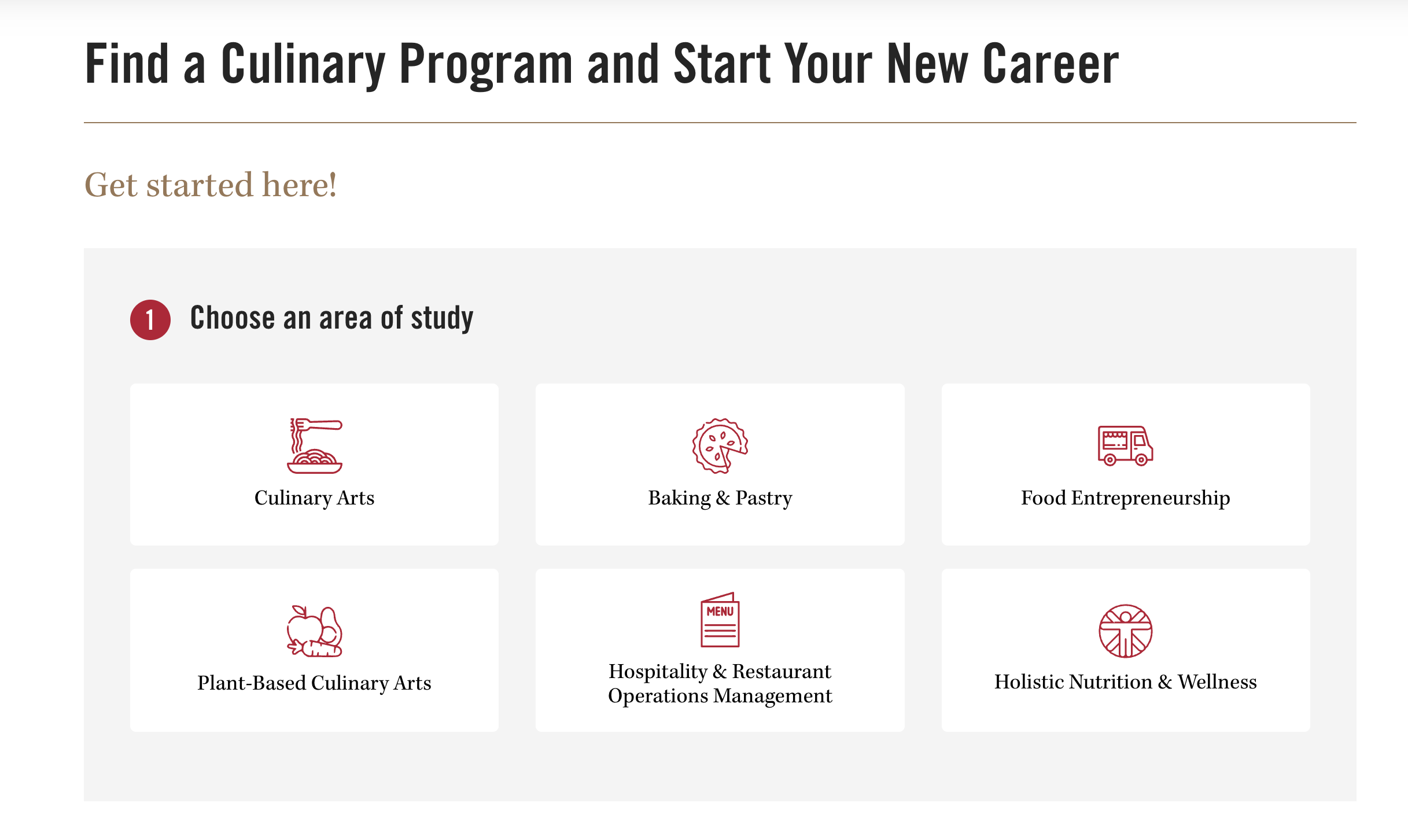
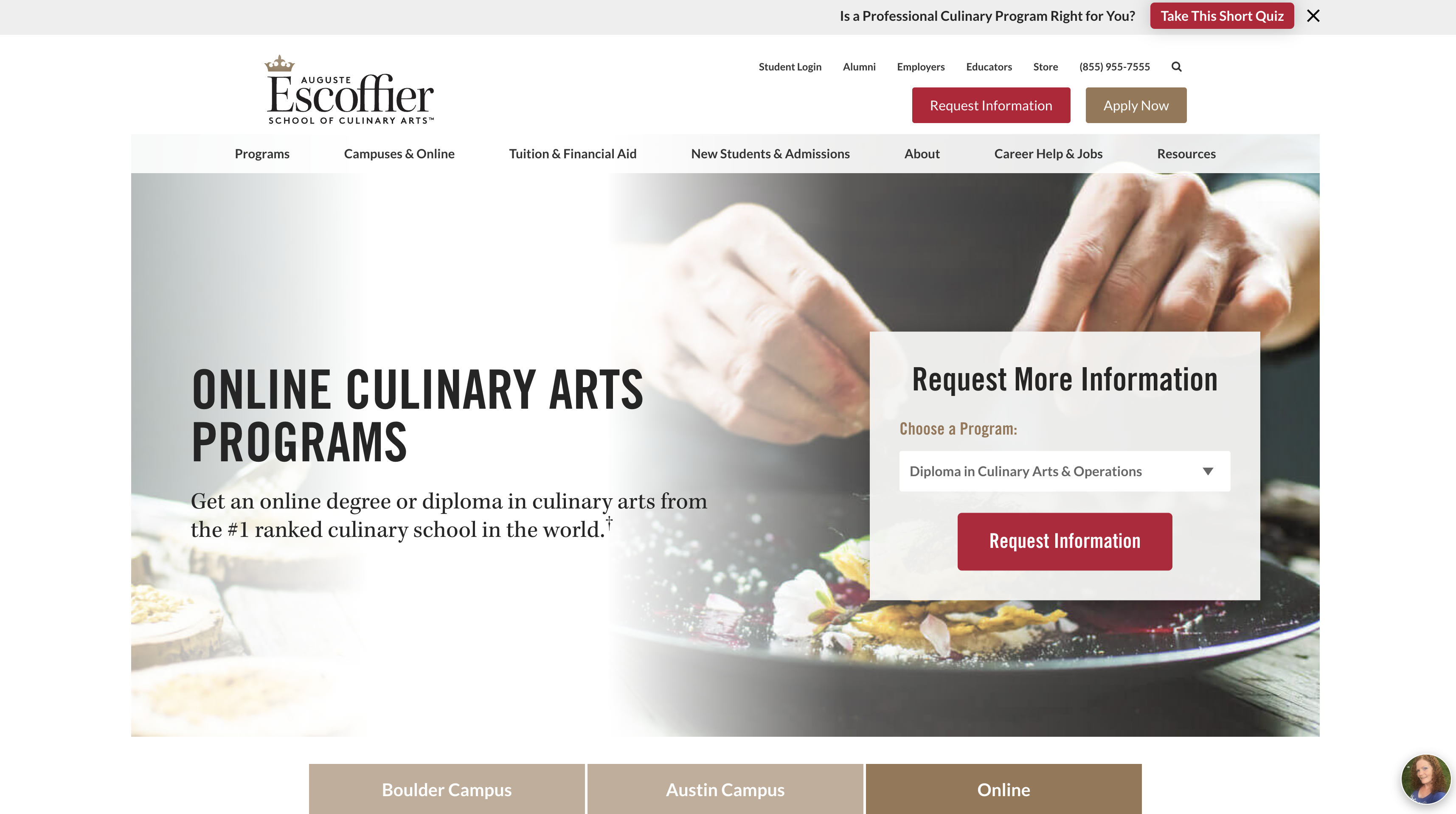
Escoffier
Scott - Very plain to me.
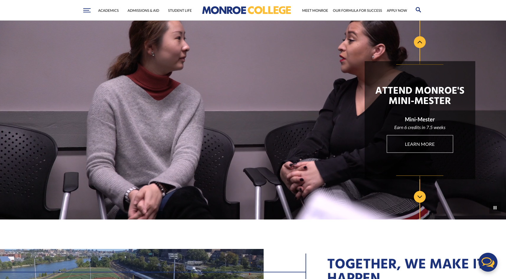
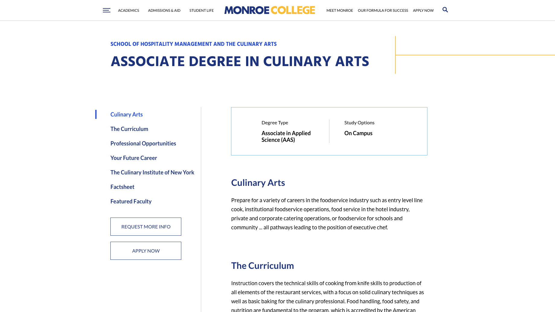
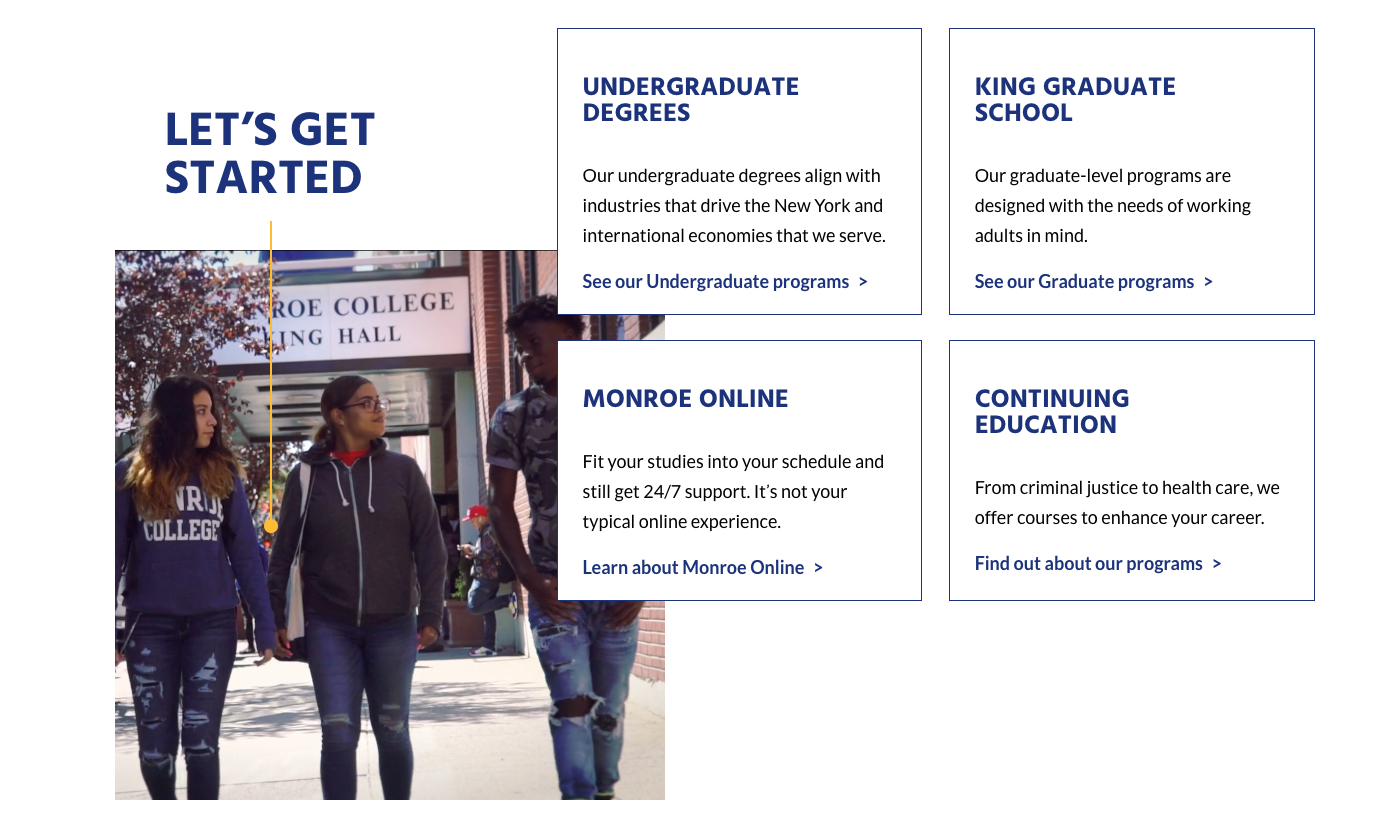
Monroe College
Dan - For some reason I really like the name of college in the middle

PACE
Dan - Nice Energy, navigation is prioritized which is nice. I would probably put CTA on primary nav vs secondary.
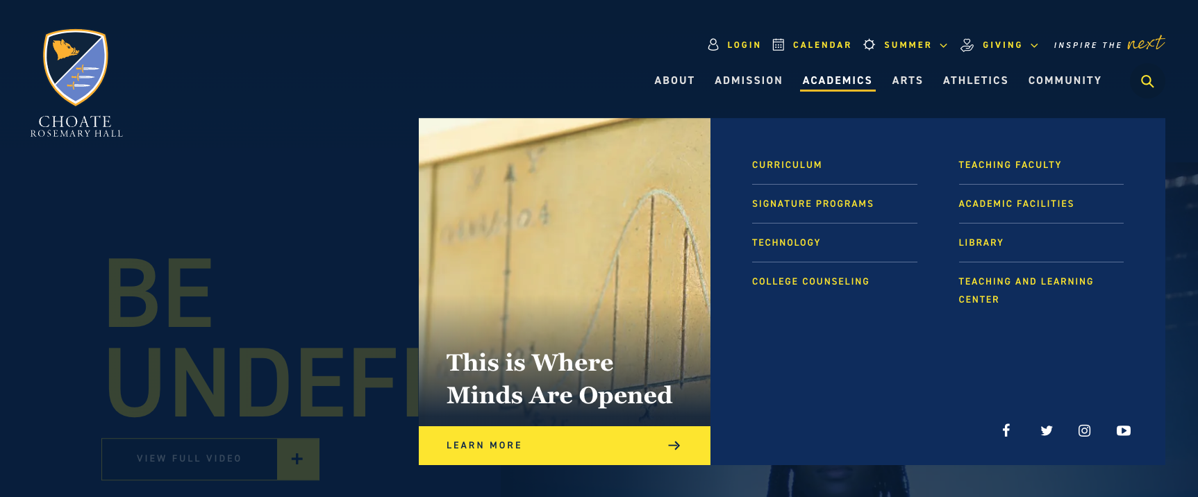
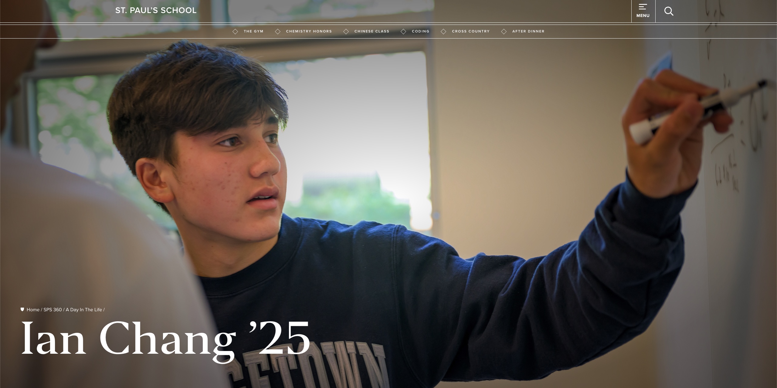
Choate
- Clean, simple, organized links with a prominent CTA in each dropdown.
- Nice use of the utility nav.

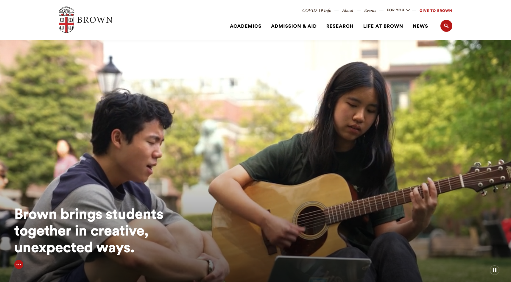
Brown
- Similar to what CIA has now but its a bit more digestible
- Simple utility nav
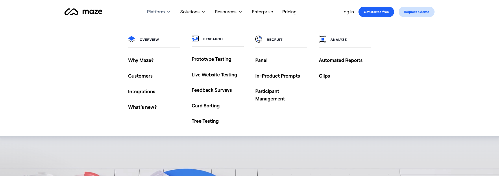
Maze
Obviously not a college but an interesting way to group/categorize a lot of pages.
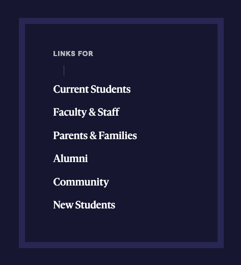
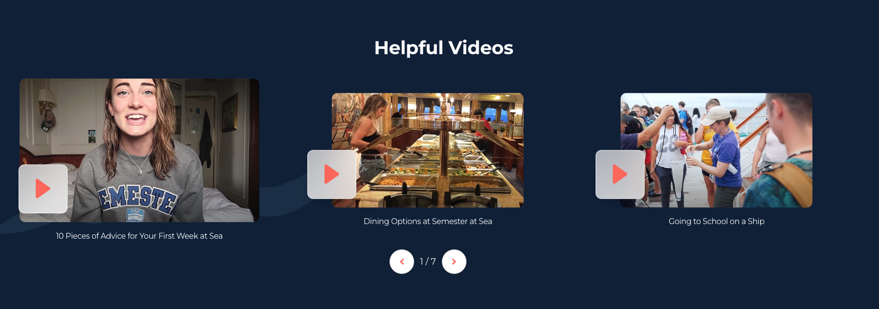
Semester at Sea
Something like this could be a good way to drive additional traffic to our master's site and current student portal while keeping the main site focused on prospective undergrads.
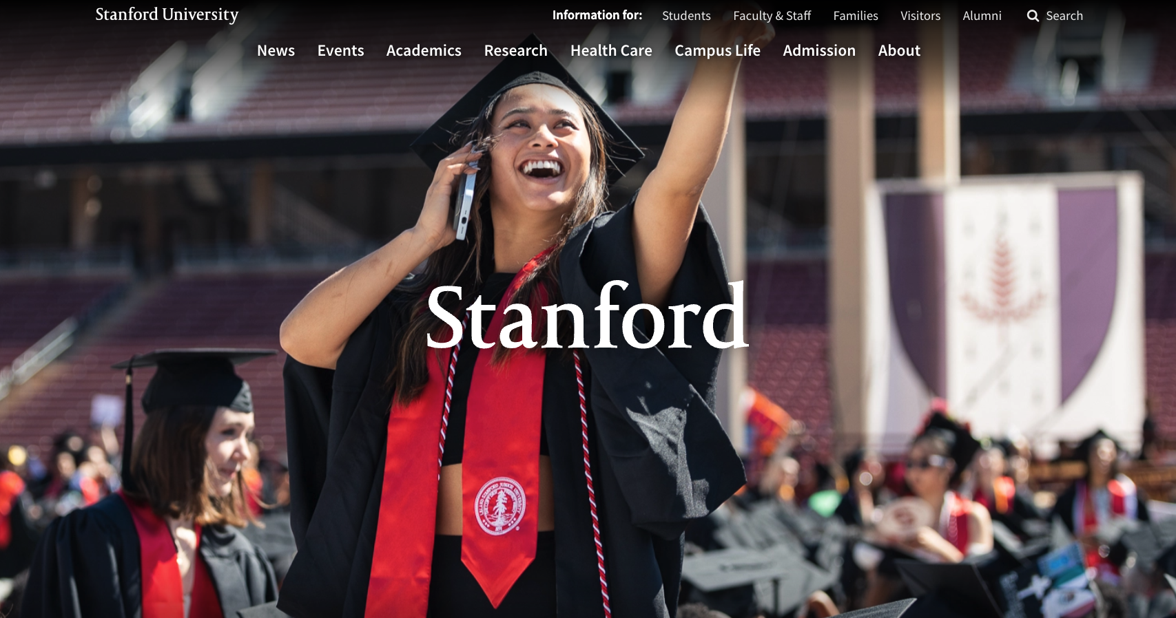
Standford
Initial view of homepage above the fold feels clean and impactful.
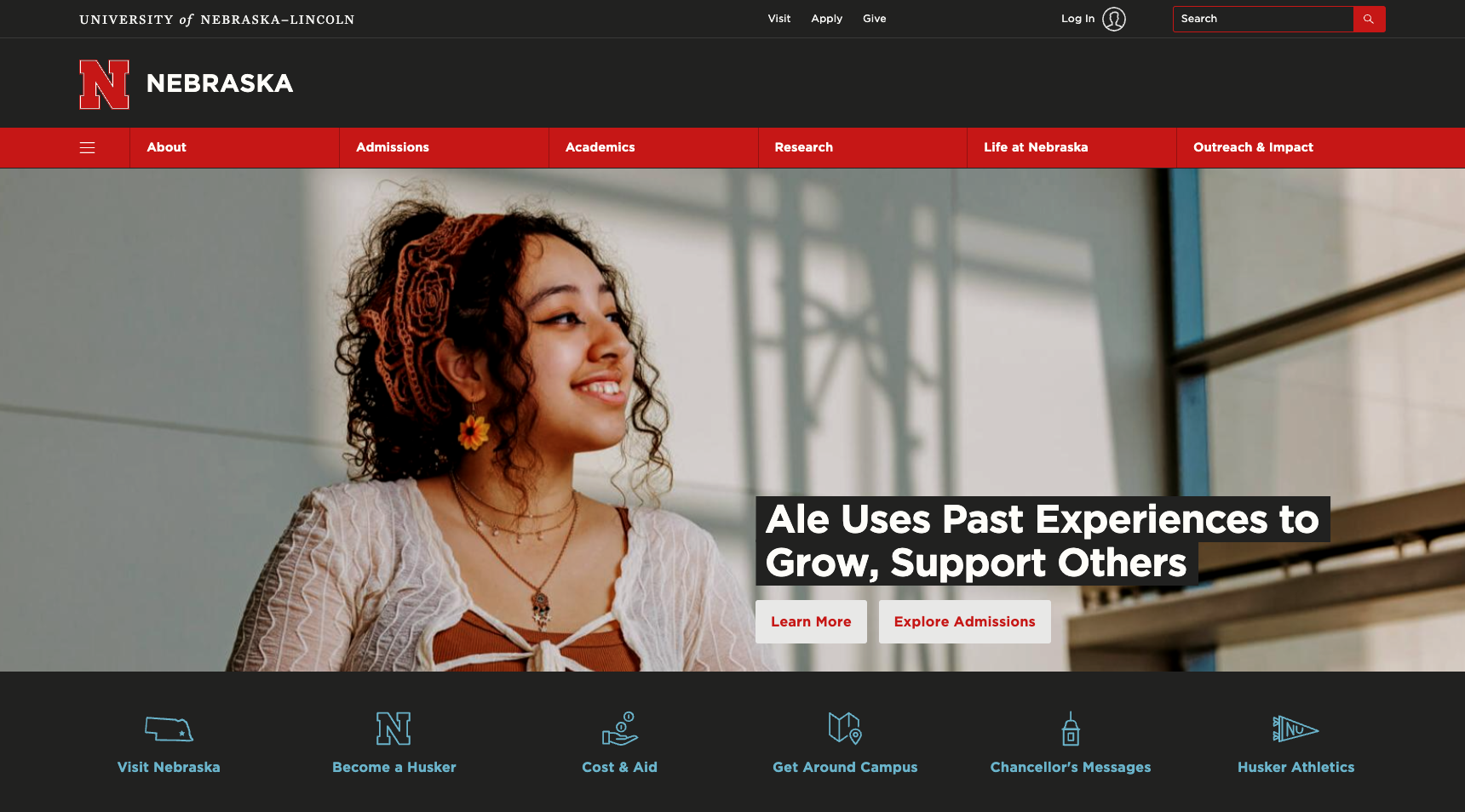
Nebraska
I like this site a lot (aside from their nav). It has visual interest, and feels distinct without being distracting and over the top. Note that I prefer the regular (non dark mode) view.
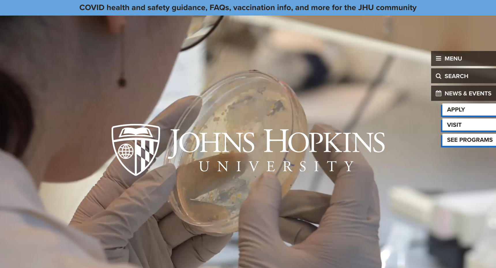
John's Hopkins University
Creative, a lot of visual interest, feels different. Maybe a little too much. Not a fan of the side nav.
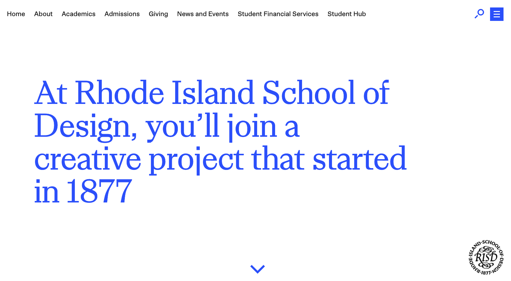
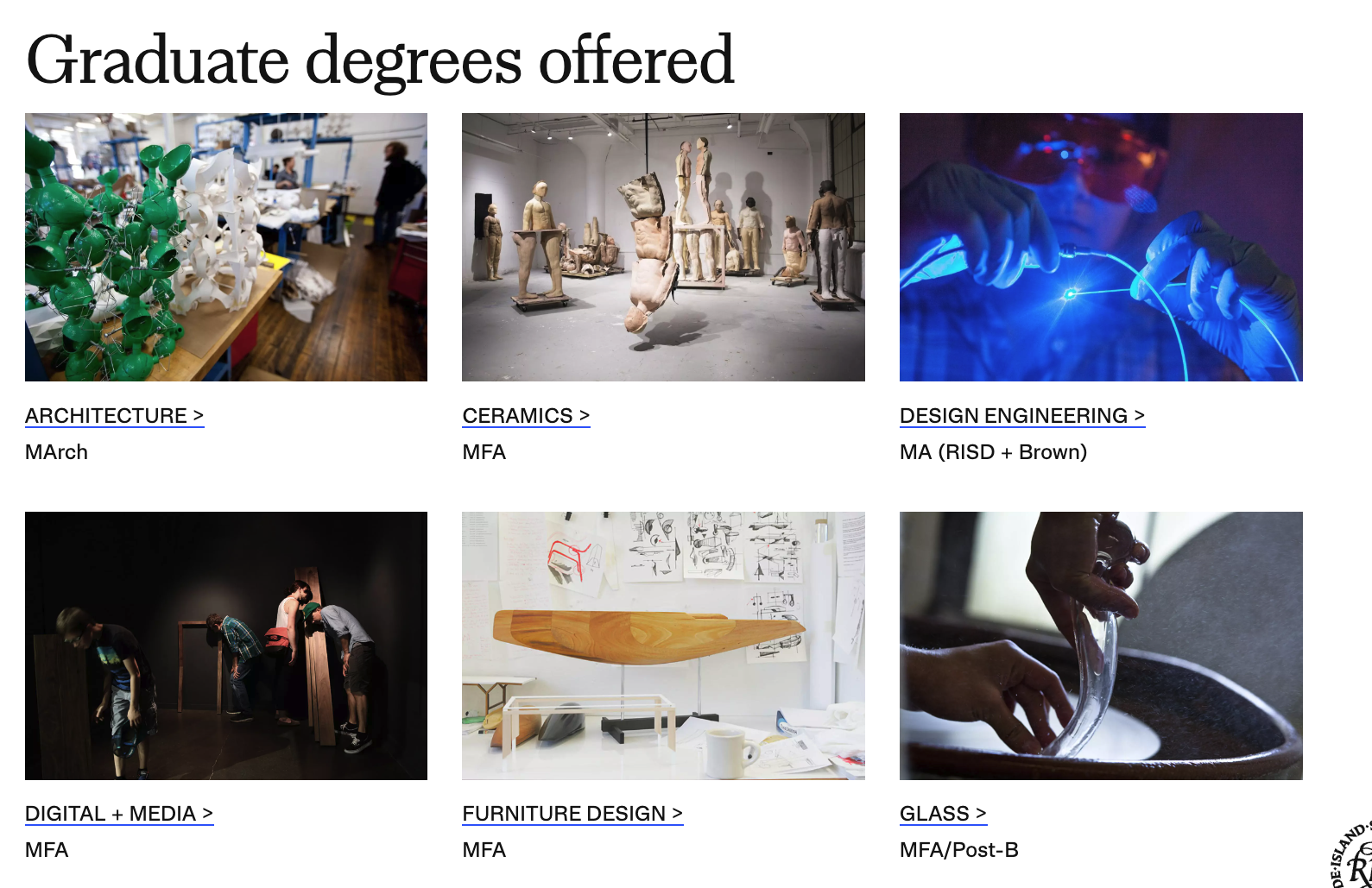
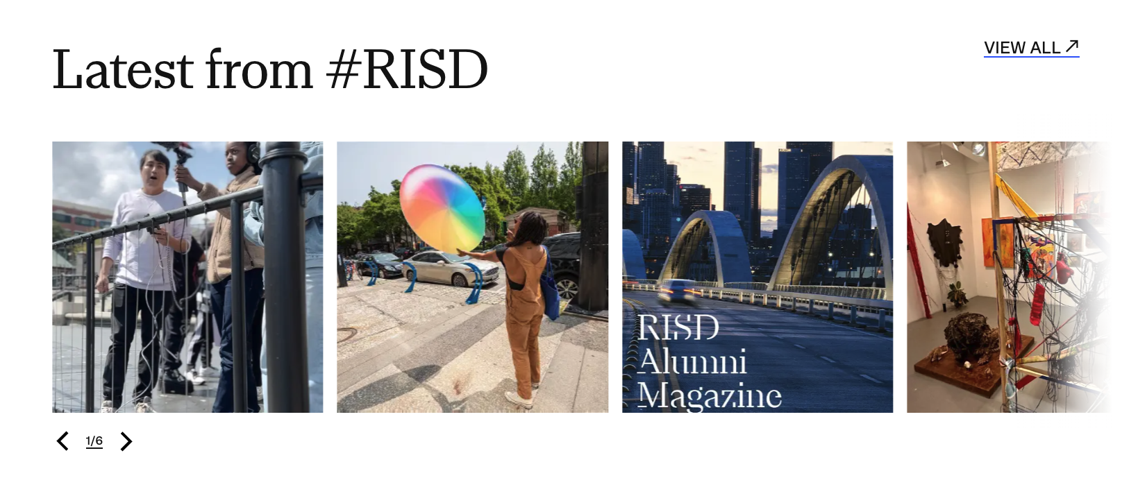
Rhode Island School of Design (RISD)
Large Typography Staggered Imagery Auto Slider with Media
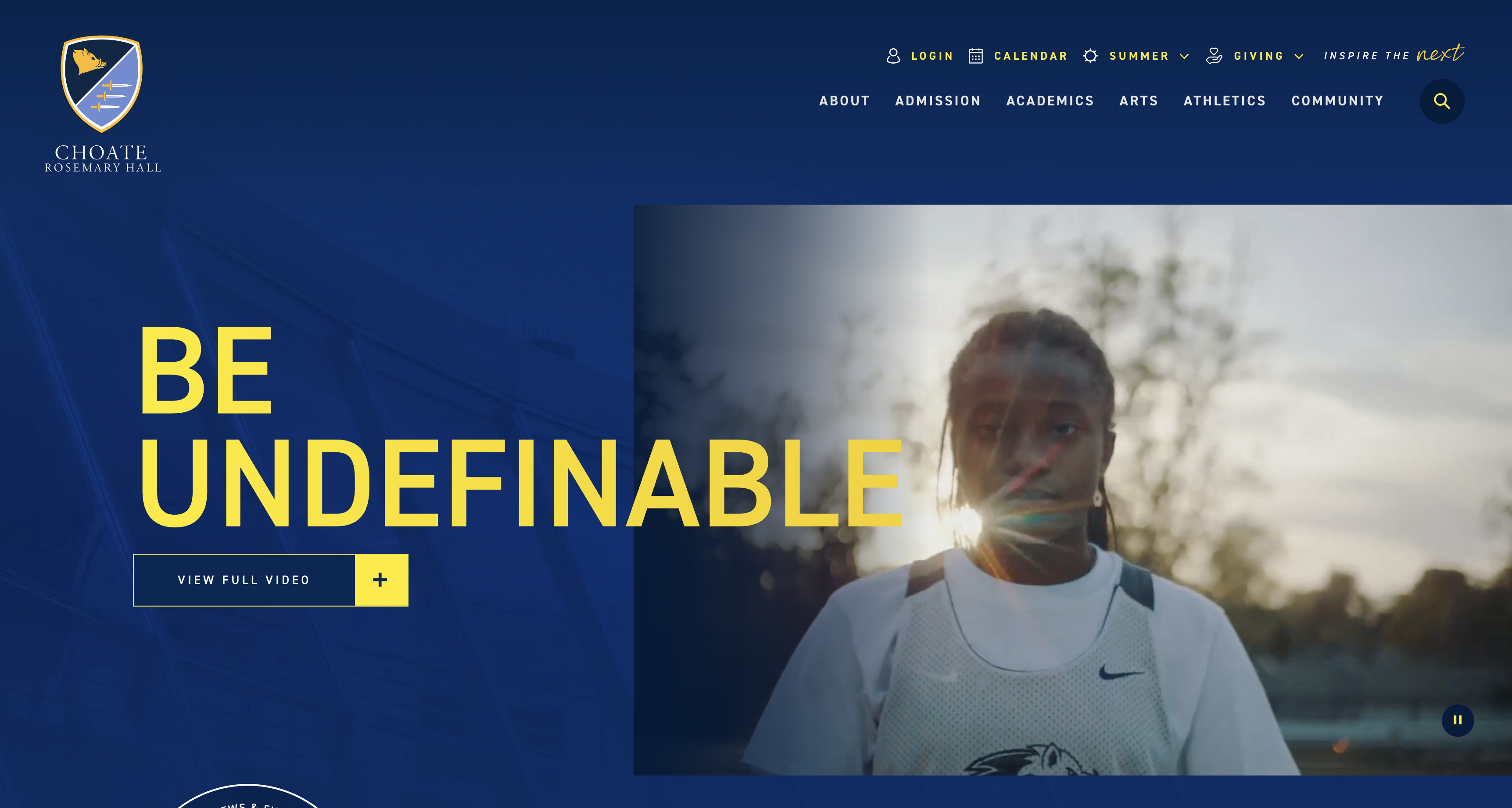
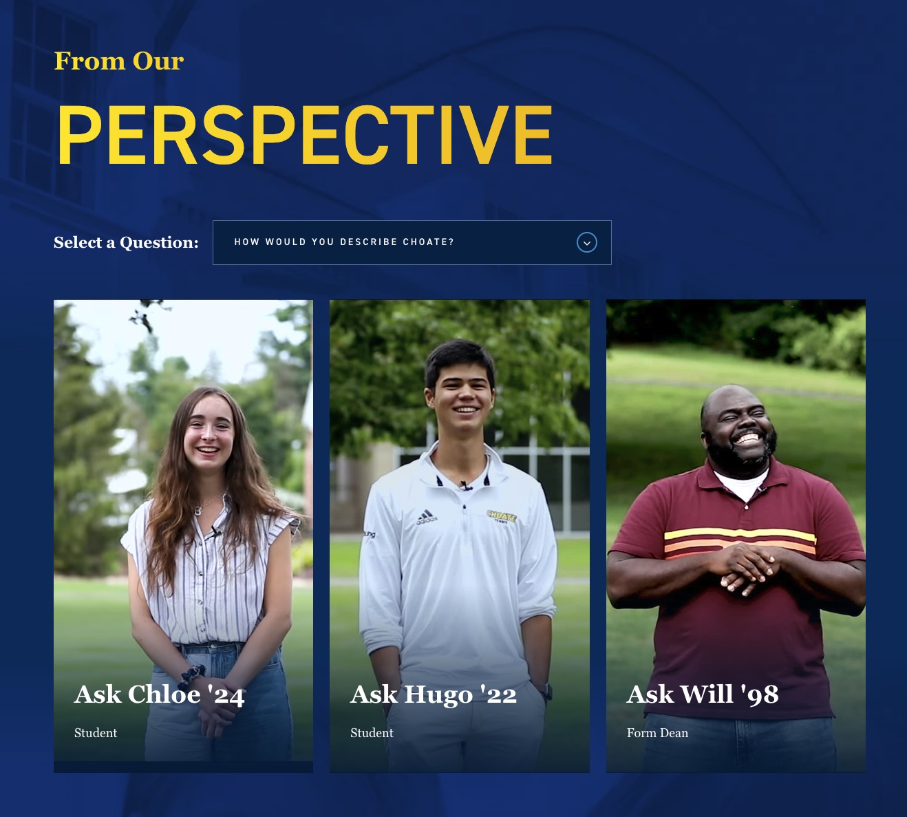
Choate
Great use of media Simple, clean yet rich design Great site transitions Large imagery & Type Lots of statistics
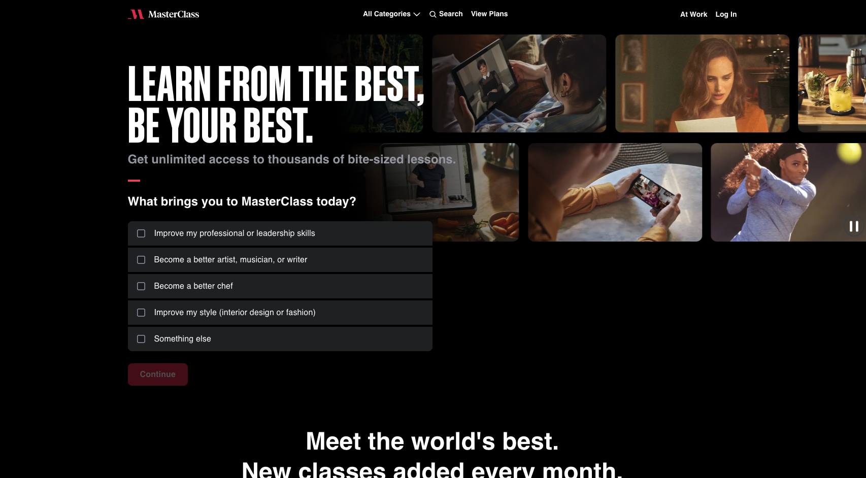
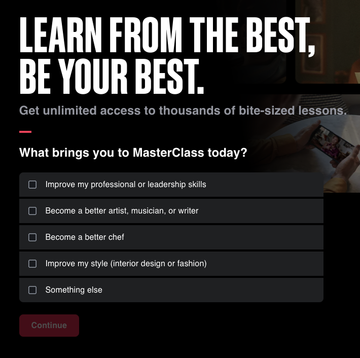
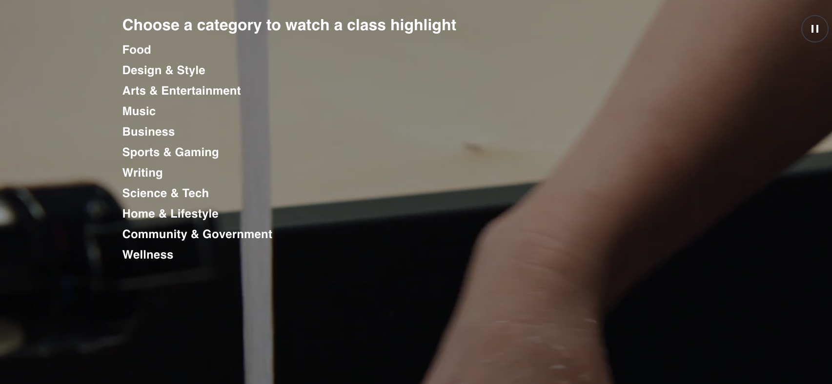
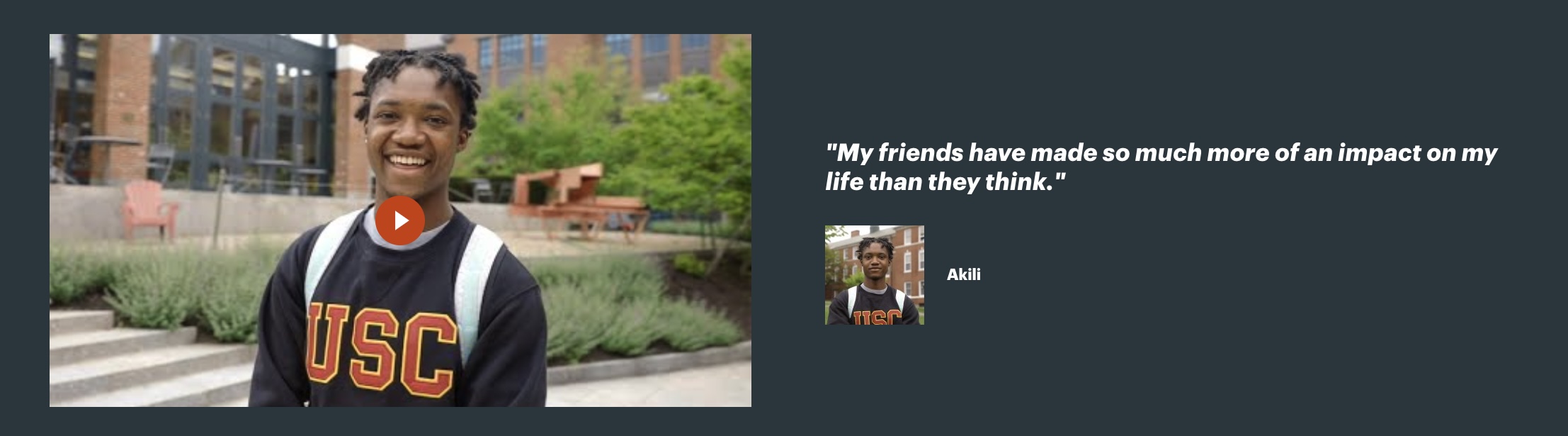
Masterclass
Question prompt in hero, making it a bit more personable Dark with a lot of media Dose of inspiration section would be great for Alumni videos
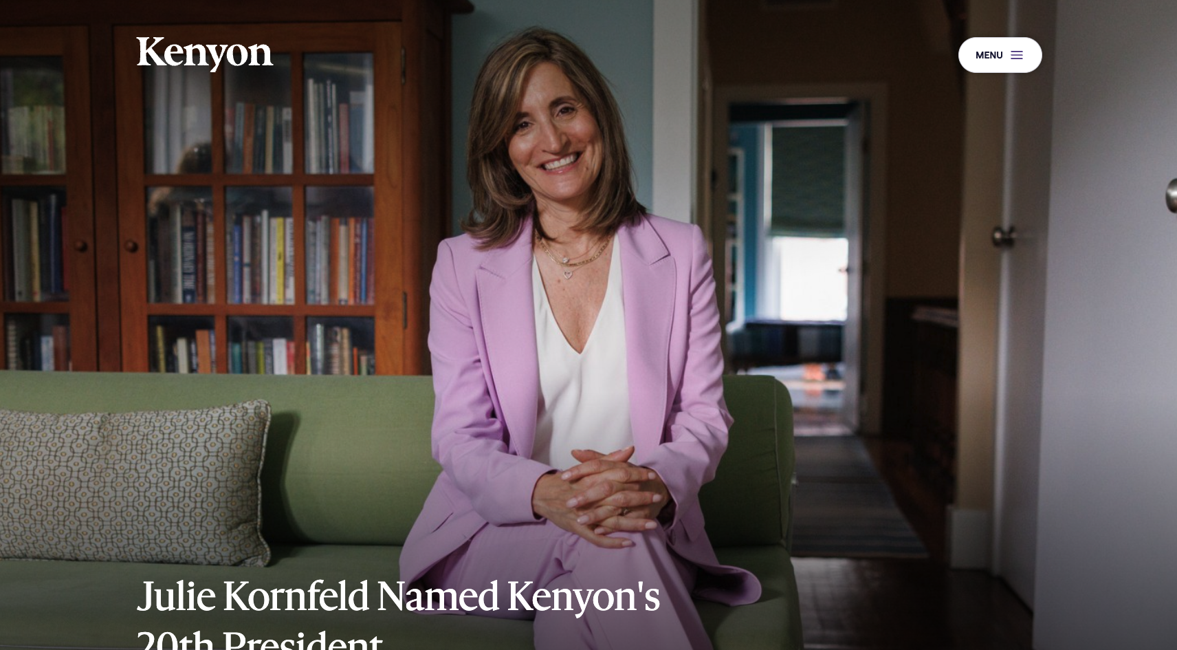
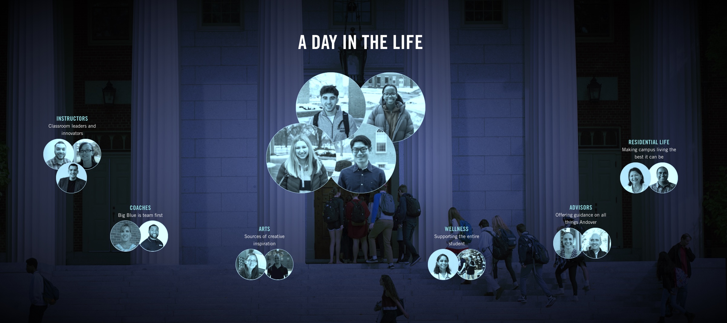
Kenyon
Inspirational Imagery Related links within each section Grid/Staggered layouts Great use of white and dark sections
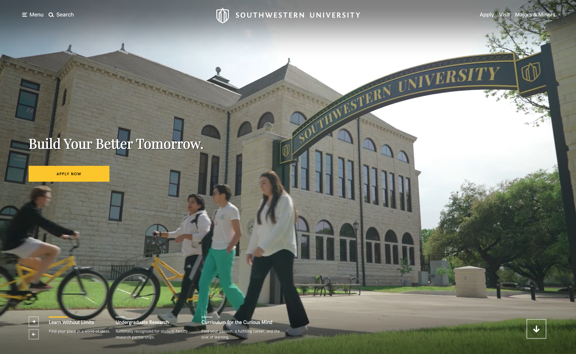
Southwest University
Large video with a very sleek modern interface design. Nice use of a single brand color