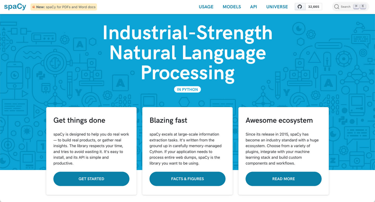
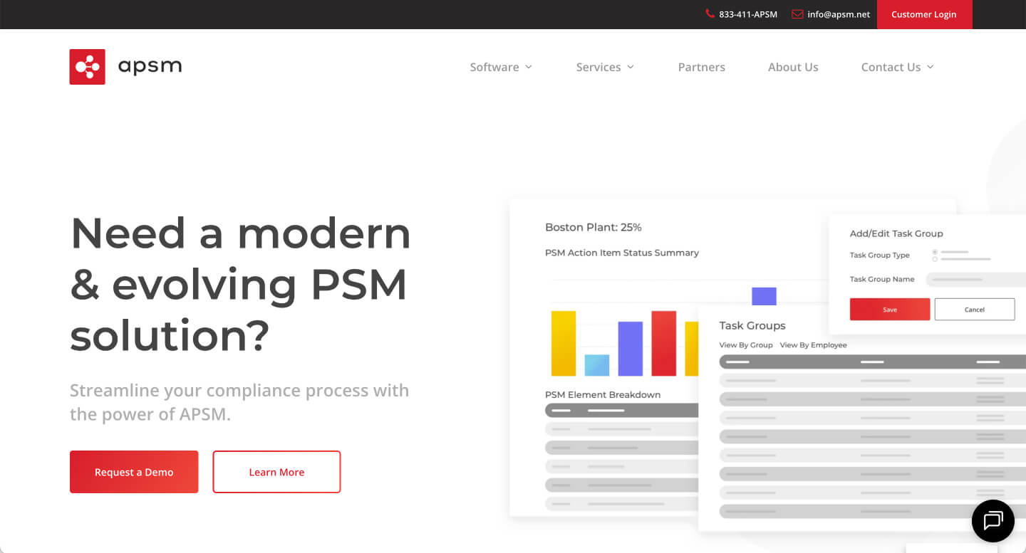
Moodboard

NetOwl

Website Kickoff

Prepared by:

Project Overview

We’ve digested your answers and pulled out the items we felt were important to discuss along with some questions to follow up on.

Mission Statement

To provide the best-of-breed products that solve the most challenging problems in text analytics and identity analytics.

Product/Service Positioning Statement

NetOwl provides the most advanced AI-based text and identity analytics products with the best accuracy, speed, and scalability.

Target Audiencess

Typically software engineers/architects or technical managers with college degrees and beyond who work in the industries below. Usually people in 30’s and 40’s. Mostly male.

Government organizations

Who have a need for fuzzy name matching functionality to support various use cases:

  • Border Protection
  • Watchlist Screening

Who need to analyze a significant amount of unstructured text content for:

  • Intelligence
  • Defense
  • Law Enforcement

Commercial companies

Who have a need for fuzzy name matching functionality to support various use cases (e.g., banks, financial institutions, solution providers to financial institutions, online money transfer companies)

  • Sanctions Screening
  • Verification of Payee
  • Customer database management

Who want to enrich a significant amount of unstructured data with added values (e.g., LexisNexis, Dun & Bradstreet)

  • Advanced search for Legal professionals
  • Adverse Media Monitoring

Primary Actions

What are the primary actions you want a user to take when coming to your site?

Let's take a quick break!

Reviewing your existing website.

What is working, what isn’t?

Additional Pages to Review

NetOwl Website Selects

APSM

Slanted lines and overlayed text blocks/images add some originality. CTA that opens up. They use too much animation though

Trulioo

Very clean/uncluttered design that balances content and white space for ease of reading and achieves variety through images and layouts. Restrained/not excessive use of animation. Not repetitive/tiring.
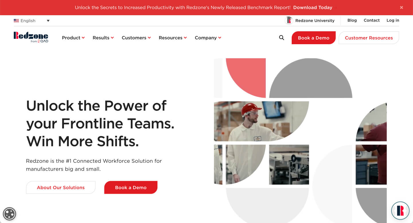
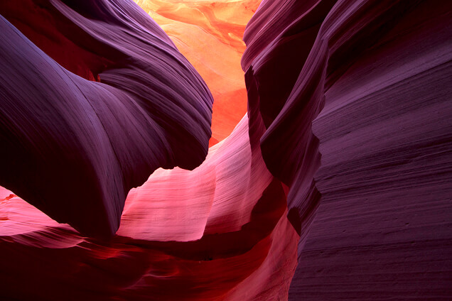
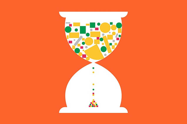
Redzone

Originality of image shapes. Not the standard rectangular images everywhere.
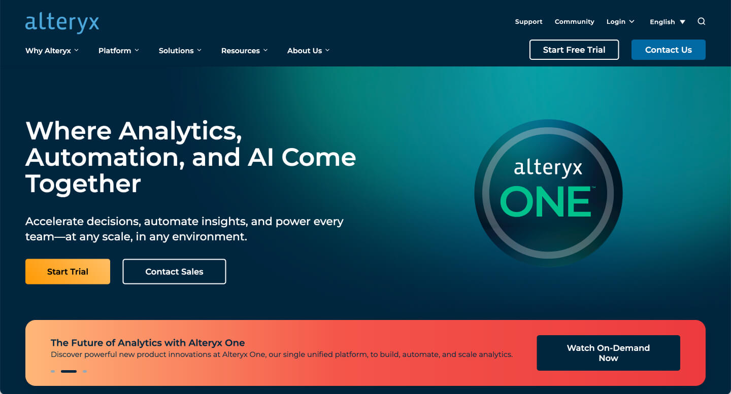
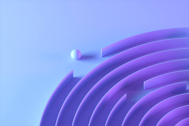
Alteryx

Nice background with gradient color. Nice animation for the graphics coming up in a staggered fashion
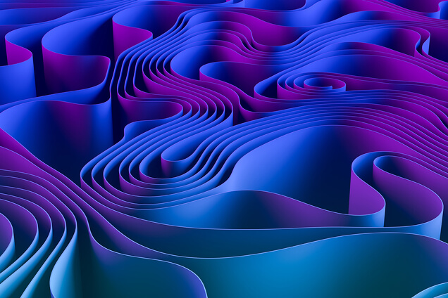
Darktrace

Nice gradient colors. CTA that is revealed when scrolling down. Too dark for us
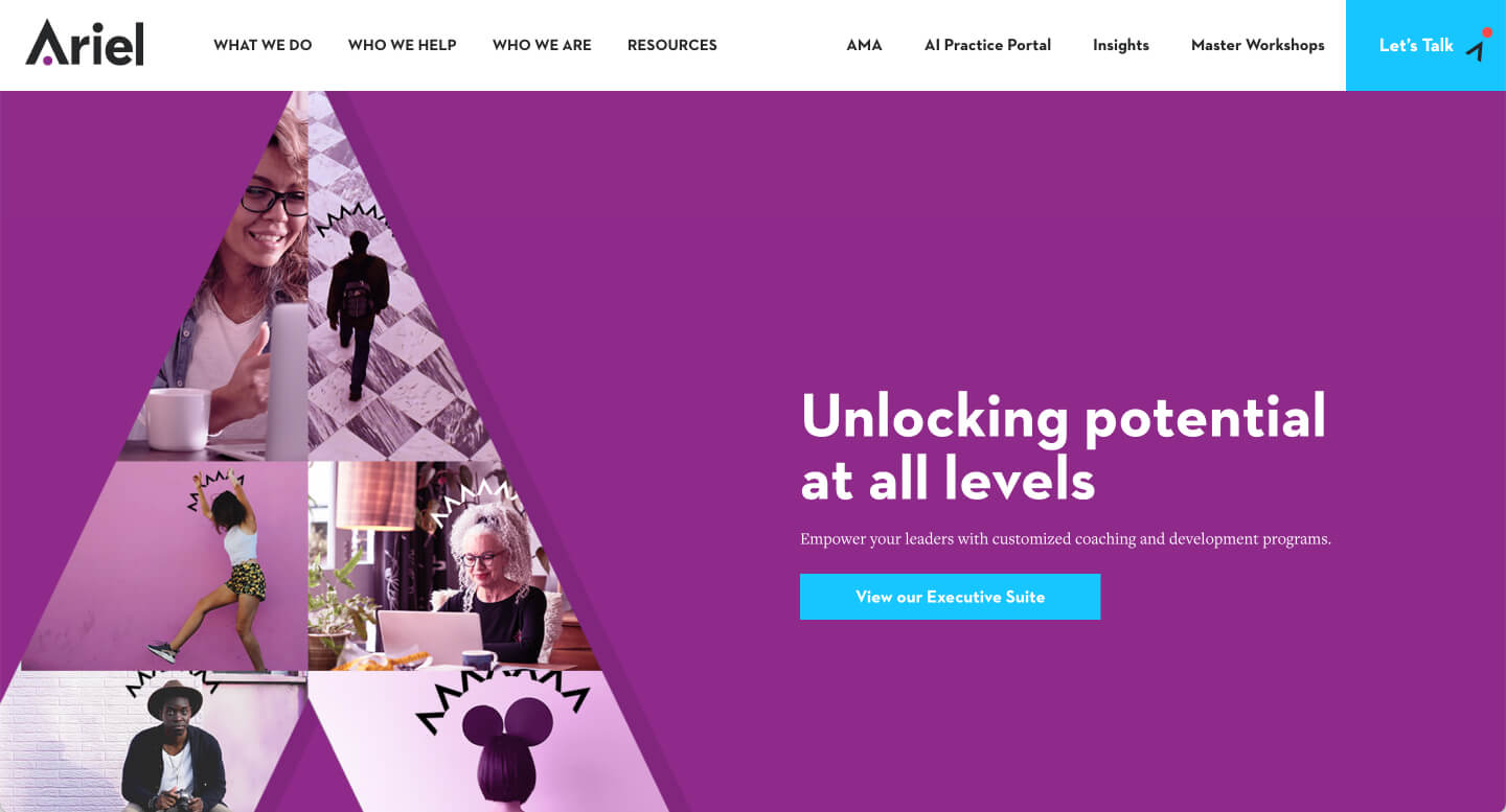
Ariel Group

Clean, uncluttered. Original banner with photo collage in a unique shape (pyramid). Not excessive animation. Too simple a design though.
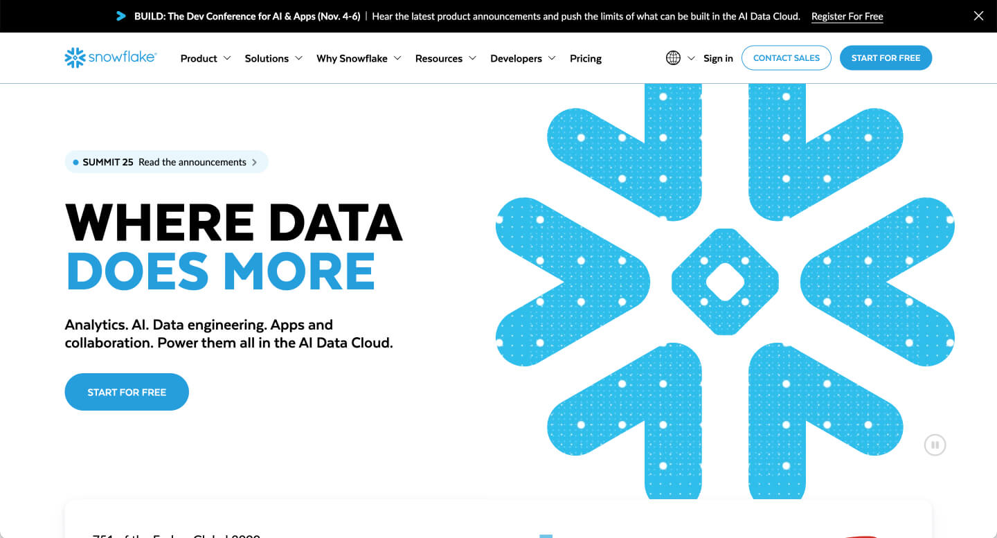
Snowflake

Their CTA. Banners in the mid sections that we could use for our “On prem or Cloud”. Their FAQ section and squiggle at the top corner of the hero.

Image Board

A selection of image content and style for consideration.

Thank you for your time!

We’re excited to get started on your project! Your AM will be reaching out shortly with next steps.