Moodboard

NYU Campaign

Website Kickoff

Prepared by:

We wanted to give you a sneak peek into what discovery will look like.

Our web strategy team will guide you through an intentional research based-process. But first, we want to assure you that we understand the assignment.

We are...

Designing a Campaign Platform for a Global Institution

This site will not be a static destination. It will be a living, evolving platform — built to reflect the scale, ambition, and global reach of the University itself.


The digital experience must inspire confidence, elevate impact, and move seamlessly between storytelling and action. It must integrate with enterprise systems, and remain discoverable in an AI-driven landscape.

Early-stage research

These sites and features are top of mind as we begin the research phase of the relationship. Plenty more to come, but we’ve already started to dig in.

Observations

Of the sites we scanned these key findings are the most relevant and actionable.

Impact transparency isn’t optional. The strongest campaign sites clearly show what dollars actually do — scholarships funded, debt reduced, professorships endowed. Donors want to see the line between contribution and outcome. If it feels abstract, it feels distant.

Storytelling should lead. The most effective sites don’t open with a donation form — they open with content. Video, alumni stories, research breakthroughs. Giving feels like the natural next step, not the first ask.

Ongoing engagement builds long-term giving. The sites that work best don’t only show up when they need money. They serve alumni and supporters year-round — events, updates, directories, news. Campaigns that only activate during a big push leave a lot of opportunity on the table.

Strong campaign names matter more than people think. “Make Possible.” “For Humanity.” “Venture Forward.” Those aren’t just slogans — they carry a point of view. When a campaign name is vague or purely numerical, it’s harder for alumni to see themselves in it.

User pathways are just as important as design. The best sites immediately recognize why someone might be there — to give, reconnect, network, explore impact — and guide them accordingly. Cluttered homepages and buried CTAs quietly hurt conversion more than most teams realize.

Industry UX Patterns

Features and UX systems common to the online higher education industry. We pull these as a baseline for “best-in-class” features so we can make them better.

Quick Jump

Navigation

Exploring different ways of presenting menu items through both horizontal and vertical navigation patterns.

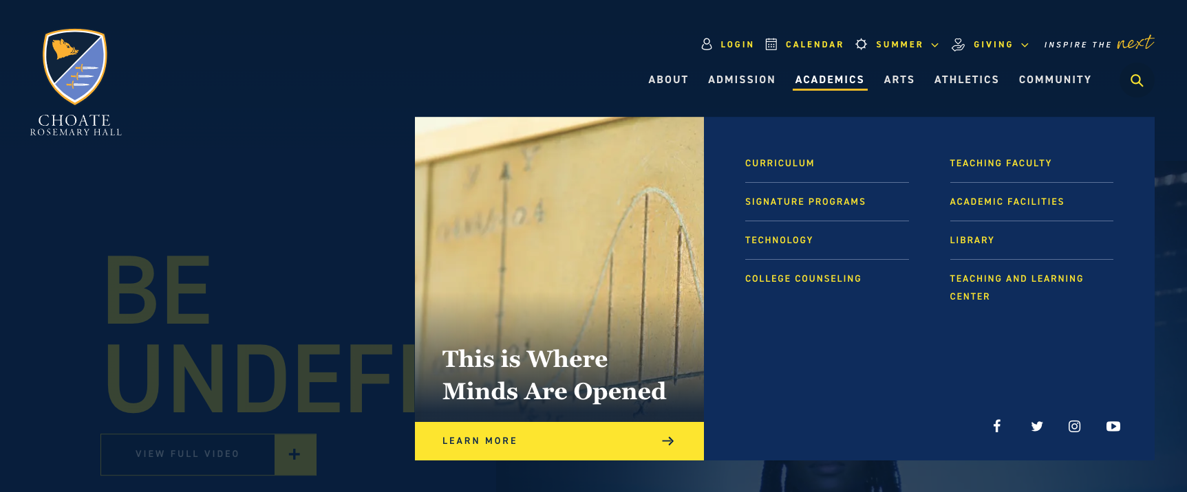
Choate

- Clean, simple, organized links with a prominent CTA in each dropdown.
- Nice use of the utility nav.

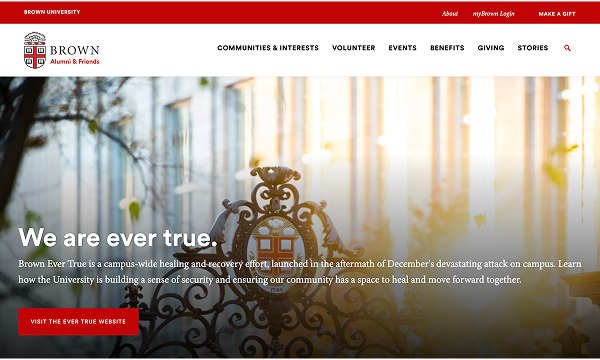
Brown

- Similar to what CIA has now but its a bit more digestible
- Simple utility nav
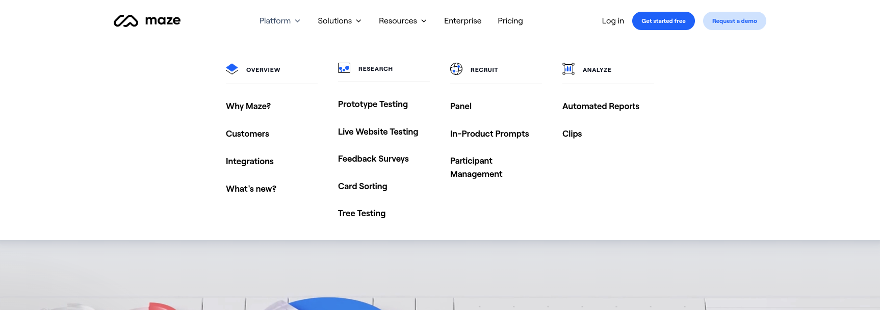
Maze

Obviously not a college but an interesting way to group/categorize a lot of pages.
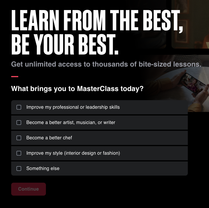
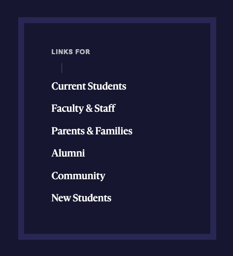
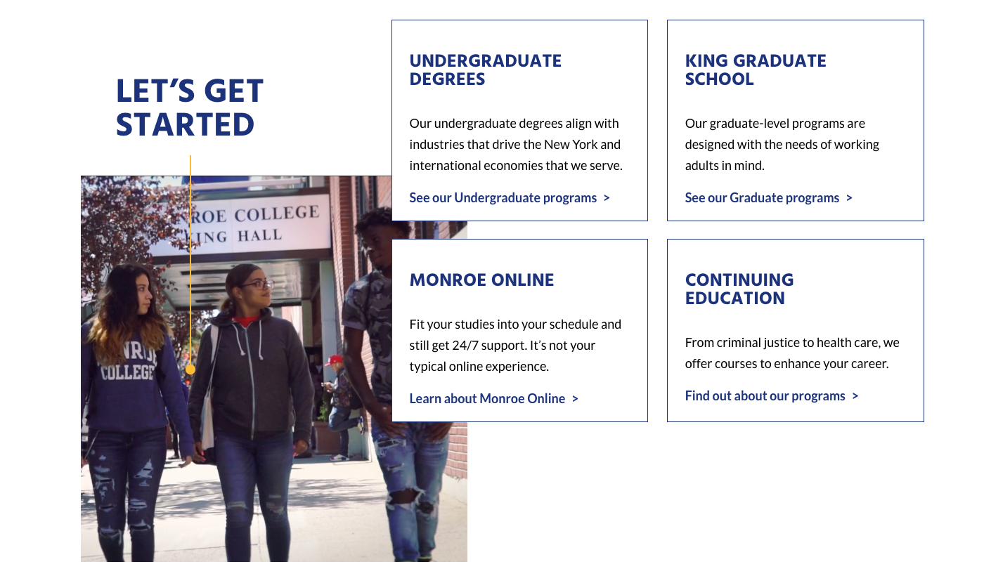
Segmented Audiences

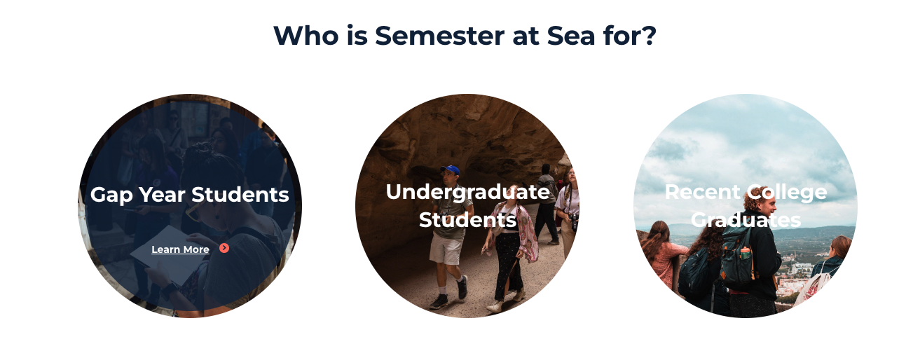
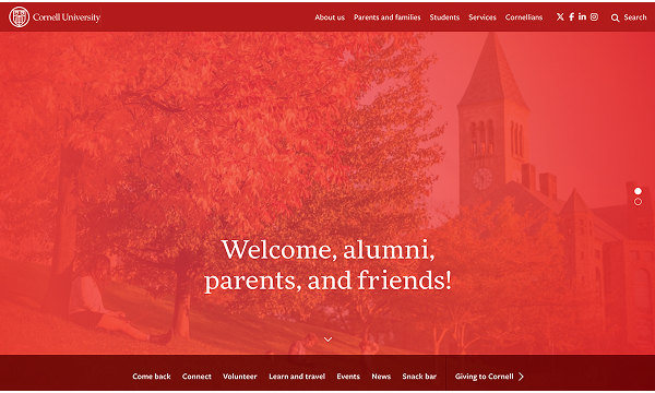
Speaking directly to your users as a means of navigation. Allow them to identify themselves and craft a buyers journey for them with a conversion focused content strategy.

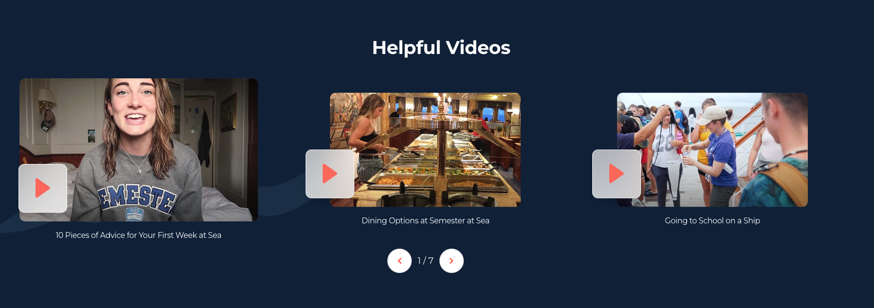
Semester at Sea

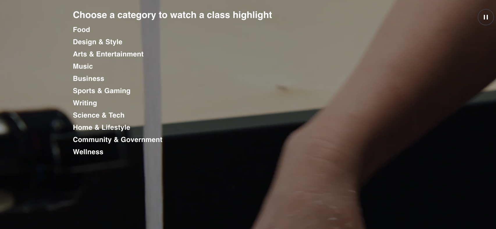
Something like this could be a good way to drive additional traffic to our master's site and current student portal while keeping the main site focused on prospective undergrads.

Self Qualification Widgets

Cutting right to the point, let your users jump right in and qualify themselves with these form based tools.

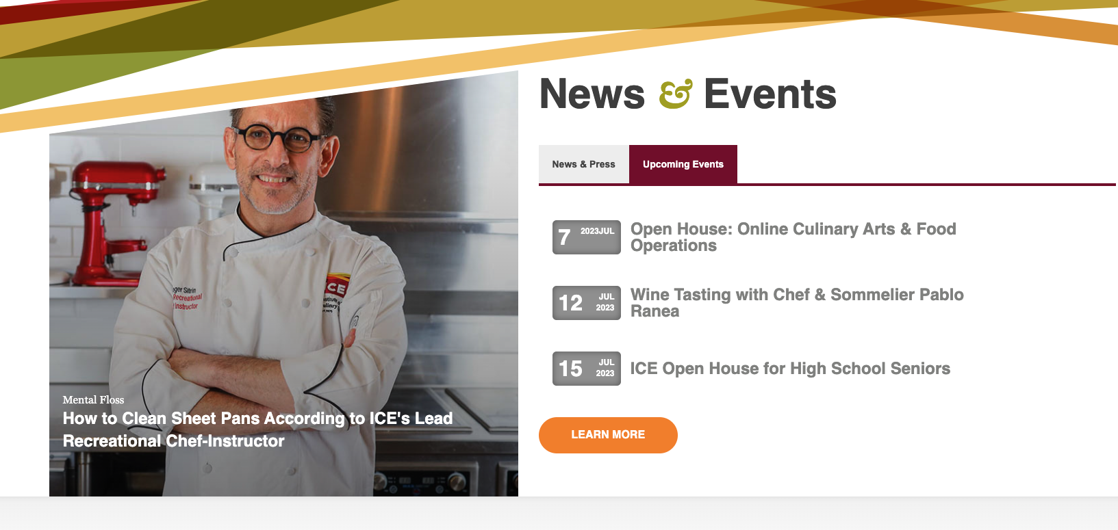
Events

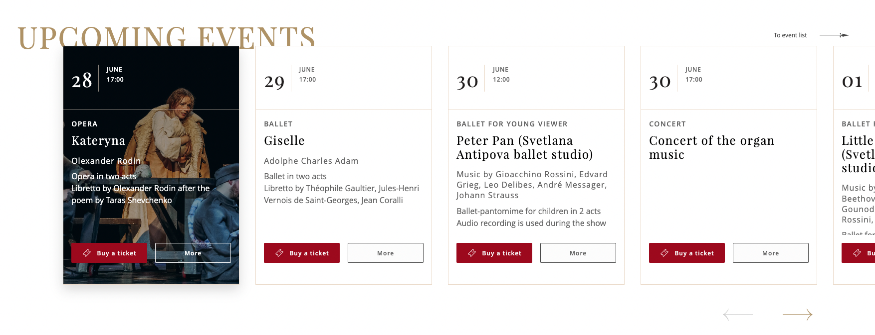
Events tools are a powerful conversion mechanism. We need to create enticing visuals that can be placed anywhere during the buyers journey to show authority and to reach prospects that might still be high up in your funnels.

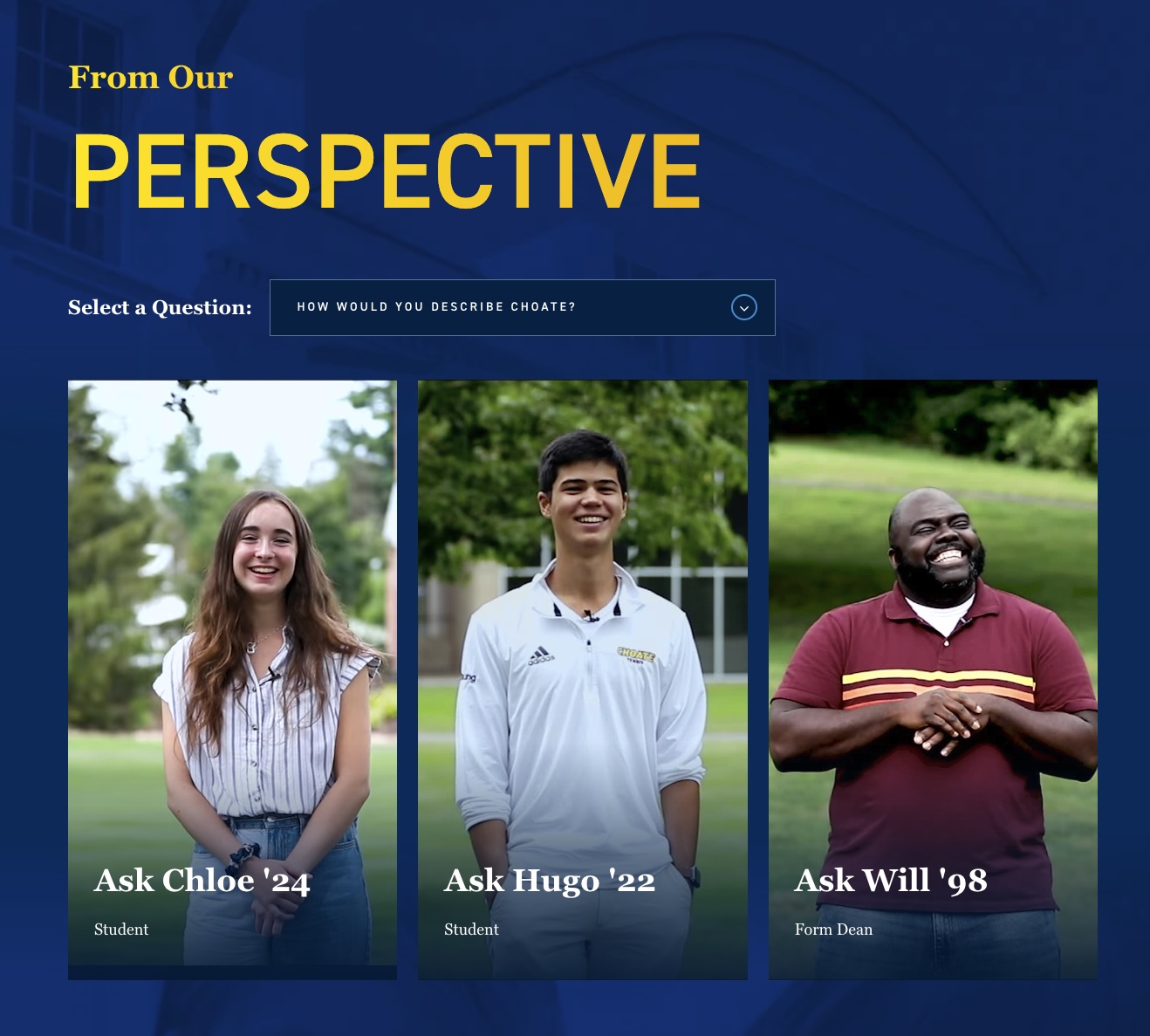
Rich Media

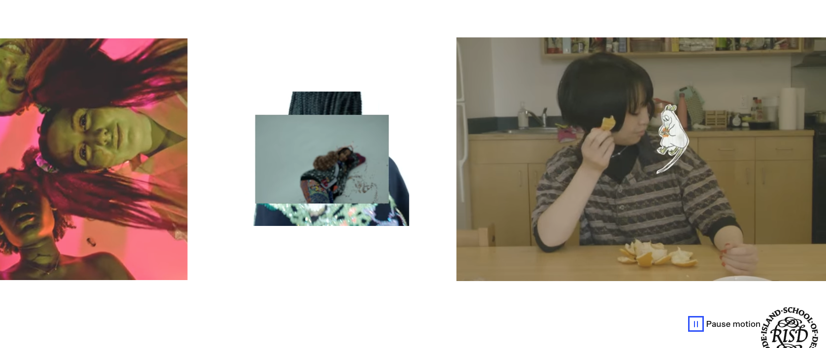
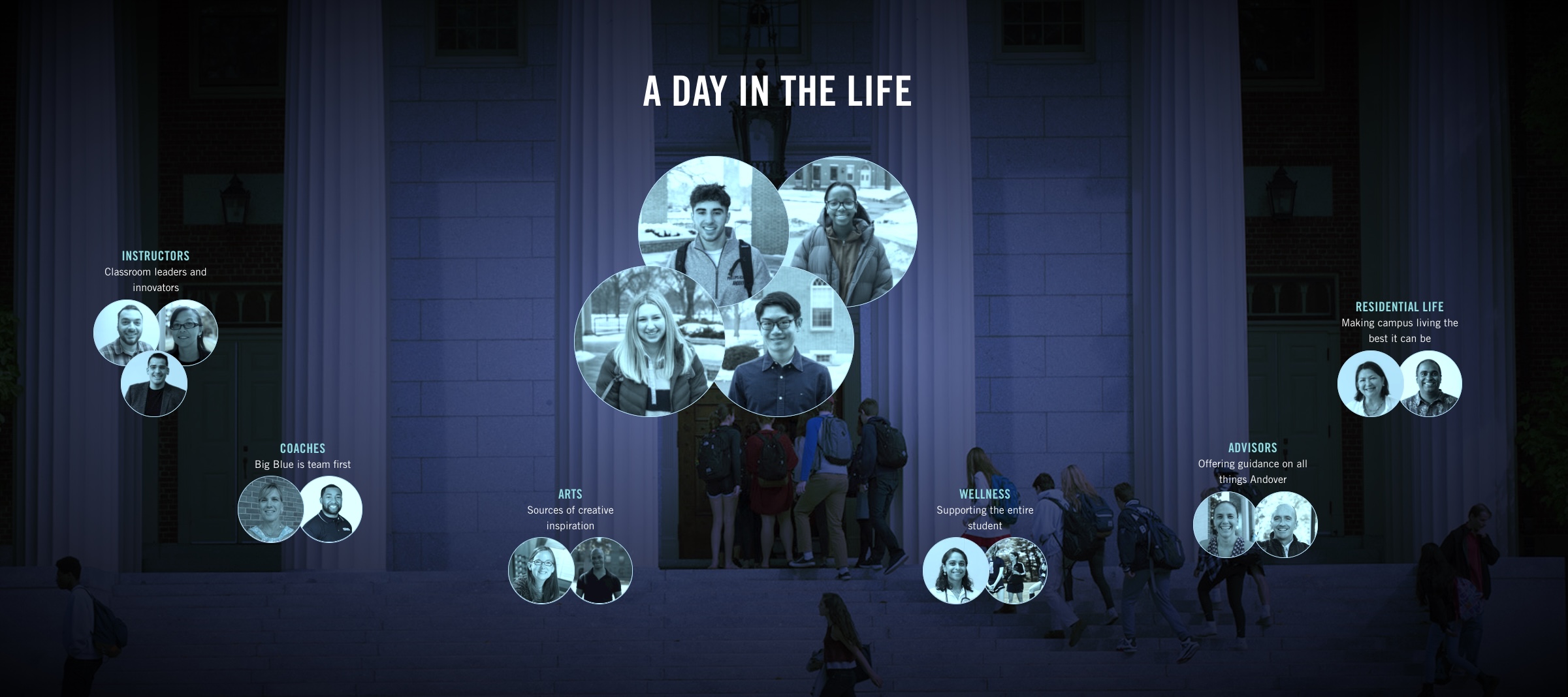
Videos and motion draw users attention like no other. Though it should be used sparingly as to not distract from your goals, bringing life to your pages through lifestyle based video assets will elevate your brand experience.

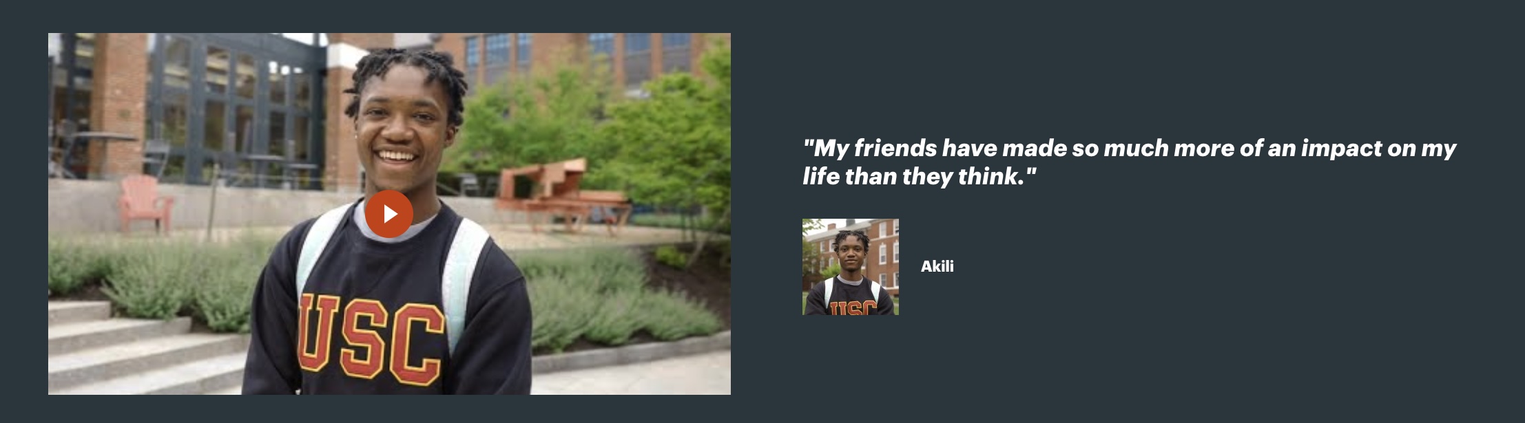
Influential Content

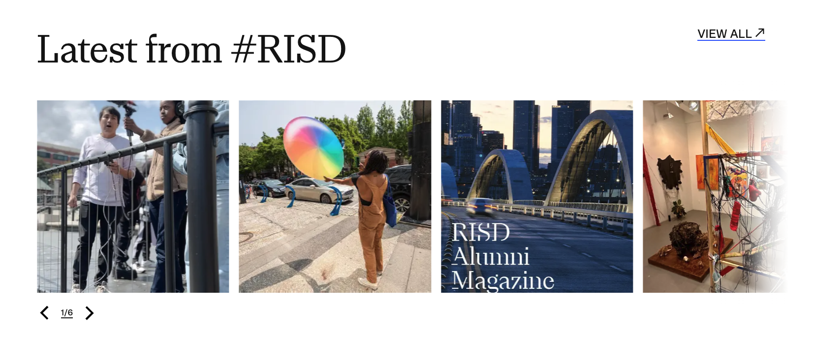
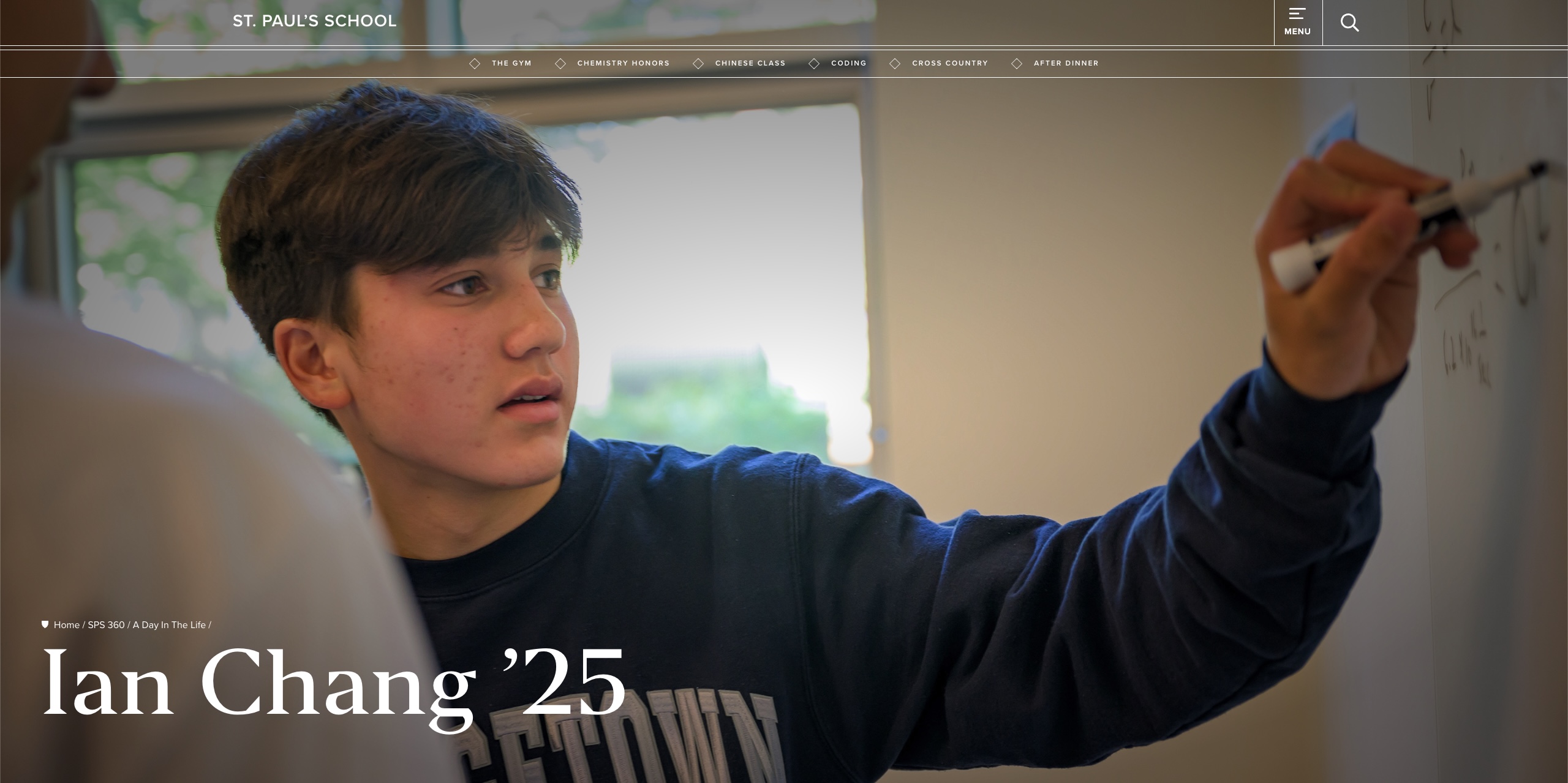
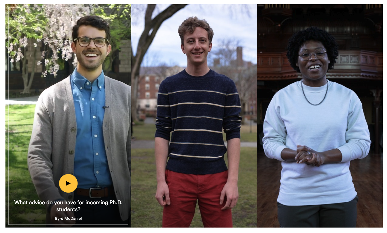
Make your users the hero of their own story. Alumni see their peers given an influential platform and begin to see themselves in that same position. On your campus, loving life, and proudly evangelizing for your next generation of prospective alumni. Alumni testimonials, social media shorts, and behind-the-scenes insights into your campus will draw eyes and create high quality leads.

Inspiration

Some of the most effective websites within your space.

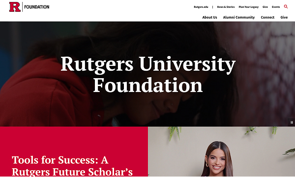
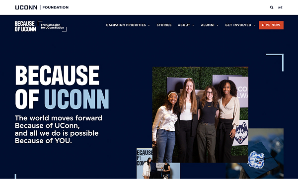
UConn Foundation

High-impact branding and campaign focus to drive storytelling and a simpler user experience.
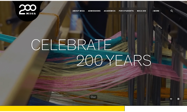
Thank you for your time!

We would be honored to continue this work and bring your campaign to life over the coming years.

…and yes, this is the brand anthem video our team created for NYU Wagner. *Humblebrag